Medium’s UX is hostile to small creators.
A website once intended for everyone has quietly become painfully exclusive.
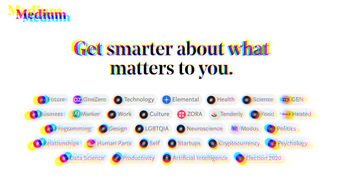
When initially signing up for the platform, a new user is prompted to either follow tags, or a multitude of Medium’s numerous in-house publications.
A website once intended for everyone has quietly become painfully exclusive.
I’ve found there is only one way to support small and independent creators, but it’s being kept hidden. How in the world did we get here in the first place?
Changes Over the Years
When I originally joined Medium several years ago, it was meant to be a simple and minimal blog alternative. An innocuous way to publish writings and documents longer than Twitter’s 140-character.
Like any exciting and fledgling startup, there was enthusiasm within the tech community for the potential of the platform. An idealistic blank page for anybody in a new, post-blog internet that was being dominated by the homogeneity of short-form and shallow social media.
And also like any other startup, there have been several redesigns over the years in both aesthetic appearance and business model.
For instance, who can forget the highly-celebrated (and most likely expensively designed) lime green logo? Seemingly plastered everywhere — for around a year or two — before quietly being replaced by a serif, monotone logo that is nearly identical to what the website had originally.
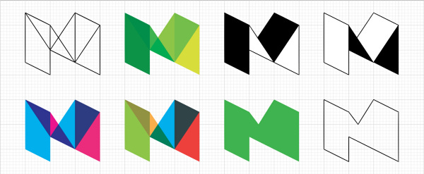
The Story Behind Medium’s New Logo by Erich Nagler
During this time of change, Medium also experimented with different forms of revenue, in an attempt to be simultaneously economically viable as well as a legitimate and integral platform for social journalism.
The idea of advertisements was played with briefly, and the ability to have your own custom domain was whisked away with little fanfare in order to emphasize that your work was on Medium as a publication, not just as a platform.
Where We Are Now
After quite a bit of tinkering, Medium settled on utilizing a membership and paywall structure in order to be economically viable. Like nearly every newspaper and magazine online, you have to pay a small amount each month to read certain (a large proportion) of stories that are published on this site.
In addition to this, Medium has been launching several in-house publications, such as OneZero for technology, Gen for politics, or Marker for business, etc. Which has caused a visible conflict of interest, with Medium to have a bias towards displaying stories from these publications towards users:

The top section of Medium’s homepage when logged in.
The first thing a user is greeted with when they visit Medium are “Featured” stories, nearly all of which are from in-house publications. Above this is a list of said publications.
Below this is where you can find 1) “New from Your Network” and 2) “Based on Your Reading History”. These modules have the ability to showcase smaller, independent creators but only if you’ve already had interaction with them. And interacting with small or new users is currently extremely difficult or impossible — and why is that? The entire reason I’m writing this article in the first place: The search function.
Search on Medium is Broken: A UX Journey
Due to the fact that your front page on Medium is curated and controlled by an algorithm, a user would have to search if they wanted to read something specifically. They can’t do this. The search functionality on Medium is just as curated and algorithmically controlled as the homepage is:
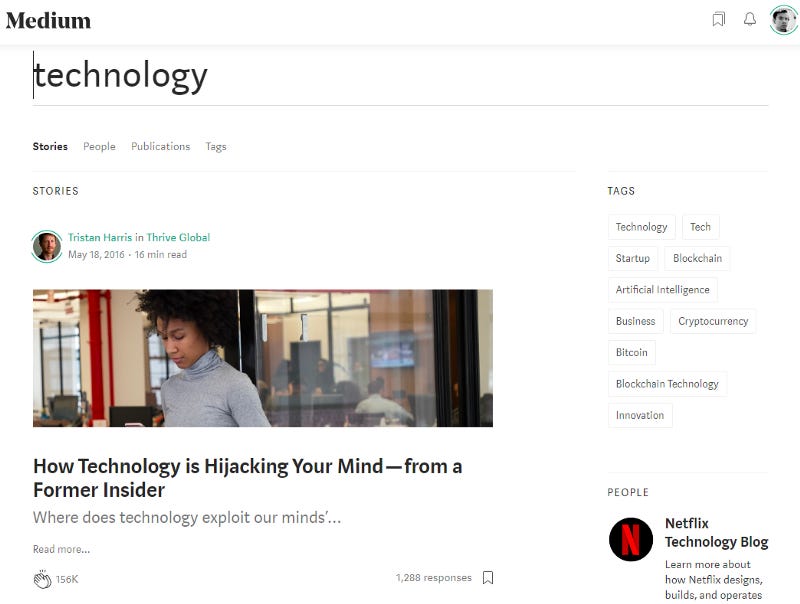
URL: https://medium.com/search?q=technology
When searching any term, the stories that are returned are the most popular, visited, or liked. Navigating to the other tabs will similarly bring you the most popular users or publications. There is no way to view most recent stories. Which is arguably the only way that anybody could find content created by smaller, independent writers on Medium.
Tags infuriatingly operate in an identical manner:

URL: https://medium.com/tag/technology
There are three tabs available when searching with tags, two of which are again, the most popular. One would think that the Archive tab would be a place to find any story with the tag, however this is not the case:
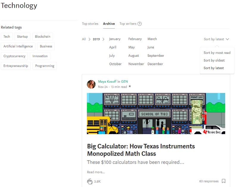
URL: https://medium.com/tag/technology/archive/2019
The Archive page gives the ability to look at stories in specific years and months, which seems helpful, there is even a function to view these stories chronologically. However, as it is clear to see, even the most latest story has 3.8k claps — why is this? Scroll down to the bottom to find out:
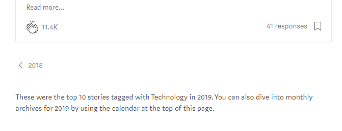
That’s right, you can only view the top 10 stories with the tag. Which means in both the general search and tagged search functionality on Medium, there is no way to navigate to page to view the most recent stories regarding a topic. But it exists:

URL: https://medium.com/tag/technology/latest
If you manually type in the above URL, then you can finally find stories from anybody that’s written them on this website — not just the most popular or internally prompted articles.
This Is a Big Problem
It’s understandable that Medium would want to highly curate the content that is viewed when visiting. You want the most interesting and thought-provoking stories to be on display for people to stick around. You also want to make sure that they’re professionally written, highly polished, and editorialized in order to solidify Medium as worthy journalism.
While this is a slippery slope, I don’t have any issue with it. My issue is that there is absolutely no way displayed on the site to navigate away from the curation to instead see absolutely everything that Medium has to offer, even if that content might be amateur or lower-quality.
In fact, the reason I originally loved Medium so much was that amateur and lower-quality content. I myself started writing here instead of a WordPress blog because it feels (or felt) more like a stepping stone towards that — a place to stretch your writing muscles and easily connect with other budding writers.
What is even the point of utilizing Medium’s business model if nobody has the chance to see what you’re doing? You already have to have a following, have connections, be in the field if you want to start a successful career on Medium, which is the very antithesis of what it was originally supposed to be about.
The UX hostility towards viewing content chronologically seems to be an unstoppable trend. It sacrifices the ability for obscure creators that might have something important and high-quality to be missed completely in order to retain viewership for as long as possible.
The optimist in me thinks this story will blow up, and Medium will add back the simple ability to click on a button that will show the latest stories within a tag.
The cynic in me, however, thinks that if somebody on Medium’s team catches wind that this rather hidden feature is used too much, you won’t even be able to manually type out the URL without being met by a depressing 404 page.
Realistically, neither of these will happen.
TL;DR If you want to support small creators, manually type in “/latest” when going through tags. Who knows what hidden gems you might find, or more importantly, which people you’ll be truly supporting.


